The Educational Deprivation Dashboard for London is a resource funded by UCL in collaboration with Linking London. It has been developed to provide a detailed overview of the makeup of educational deprivation in London schools and colleges.
The Dashboard enables a comparison of a range of metrics used to measure deprivation – and so, we thought that it may be a good idea to have a closer look at one of the metrics integrated within the Dashboard: TUNDRA.
The Office for Students (OfS) released a new experimental metric to examine HE participation geographically in 2019. While we are all familiar with the POLAR measure, TUNDRA is a similar measure, but with a number of differences which I will outline below.
Firstly, the OfS was right to release a new metric to examine area based participation, given the methodological flaws with POLAR4, in particular with the underlying population data. These figures were calculated using population estimates, which resulted in 8% of London MSOA’s (Middle Super Output Areas) having more than 100% participation rates. Of course, this is not possible (you cannot have higher participation than there are learners) and while these areas were pushed down to a 100% rate for the construction of the quintiles, this level of inaccuracy is extremely problematic given that POLAR4 was and is not only used as a metric for Universities APPs (Access and Participation Plans) but also as a metric for millions of pounds of funding.
In contrast, the greatest strength of TUNDRA in terms of its methodology is a much more rigorous accounting for the base populations. Here, data is collected from the Department for Education for all Key Stage 4 learners at mainstream state funded schools. The years of collection for these learners’ home addresses were 2010 to 2014, who were then picked up in the HESA (Higher Education Statistical Agency) data (using fuzzy matching) for the academic years 2012/13 to 2017/18. This of course brings TUNDRA much more up to date than POLAR4 which went up to the 2014/15 academic year.
So far so good. We have a much more credible base population, and an equally rigorous participation dataset. Of course, not all learners attend mainstream state education. In 2016 there were 518,432 attending Independent Schools, which represents approximately 7% of all learners. (see ISC Key Figures Report here). While this is a minority, we do know that these learners are over-represented in Higher Education overall, and in particular at Oxbridge and Russell Group institutions. Due to this I would suggest that the OfS consider working with the independent school sector to include these learners in the dataset.
I do also have slight ideological objections to the decision to only include mainstream schools in the analysis – as this seems to pre-suppose that learners from special schools, or Pupil Referral Units are not going to enter Higher Education. In terms of Widening Participation (which is at the heart of why we develop all these metrics) this seems to me to be opposite of what we should be doing. Surely our task is to include these learners, and develop ways to encourage them into Higher Education if they choose to do so. I for one would welcome a participation measure that looks at those learners from PRUs, Special Schools and Secure Units.
While TUNDRA so far really does seem superior to POLAR4 due to the base populations, for me the England only focus is another weakness. POLAR4 was the first iteration of the measure that included all nations, so restricting TUNDRA to England only feels like a step backwards.
Finally, the TUNDRA method was sensitive to those MSOAs with a very low base population and suppressed areas with lower than 50 participants. In all there were only 27 of these. This is also an improvement on POLAR where it has been calculated that an individual in an MSOA with fewer than 50 base population can influence the overall calculation by 2 percentage points. The OfS has released a methodological note on this here.
Since the development of the first iteration of TUNDRA in 2019, the OfS updated the dataset to include those Key Stage 4 learners from 2012-2016 cohorts (again using fuzzy matching with the HESA data for the 2014/15 to 2019/20 academic years when these learners would be 19). In addition to this they also produced a version based on smaller geographical areas – LSOAs (Lower Super Output Areas) and no longer consider this metric to be experimental.
For me, the test of any new geographic based metric is to look at London – a large city with a lot of population movement, and a mix of wealthy and poor areas, often in close proximity. By examining the TUNDRA map (which is very slow to navigate) alongside the POLAR4 map, some interesting differences emerge.
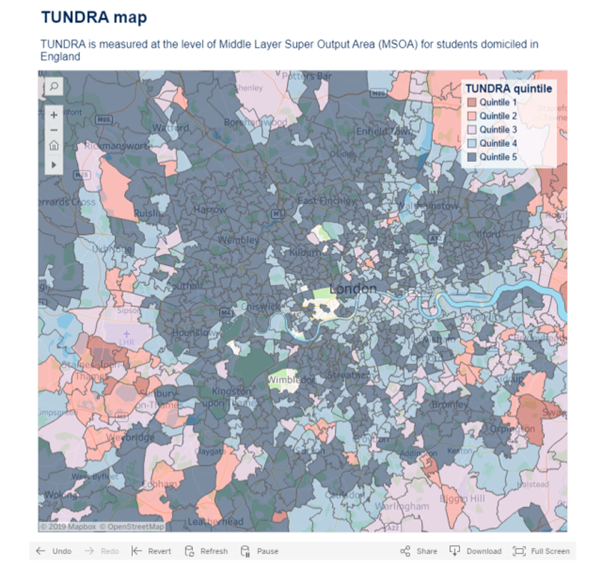

It seems that by not including the independent schools, parts of West London move downwards in terms of participation. This is an interesting development, and may well lead to more accurate analyses of WP cohorts and their participation rates.
Overall when compared with POLAR4, TUNDRA seems to be a much more rigorous and robust metric. I would recommend that all institutions update their approach to geographic based participation rates and move beyond POLAR4, instead using the TUNDRA metric.
Karina Berzins is a Widening Participation expert who recently built a dashboard for schools in London using a number of metrics including TUNDRA. For more information click here.
This post revisits my views about TUNDRA based on an older blog, written for Continuum: the Centre for Widening Participation Studies in 2019.
